Legends of food redistribution to Australians in need, OzHarvest, needed help with their primary website that had become ironically bloated after years of unfettered content creation. As an agile charity with limited resources, pages were often published quickly without considering the website as a whole. Much more than a refresh, we streamlined and enhanced OzHarvest’s digital experience and processes to better support both staff and a diverse range of audiences.
OzHarvest uses its website to speak to diverse audiences on a daily basis — from people in need of food to volunteers and supporters, to community partners and corporate sponsors (and more). The website was run by a team of marketers that needed a simple and efficient content management system to support their diverse needs. A streamlined and easy-to-navigate experience for all was our first step toward a sumptuous digital experience.
We started by leading a user experience workshop with OzHarvest to understand the nuances of each content and audience stream. Ensuring a collaborative process from day one paid off at every stage, building trust and leveraging the expertise of all involved.
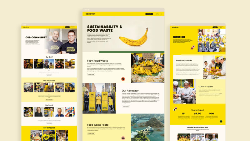
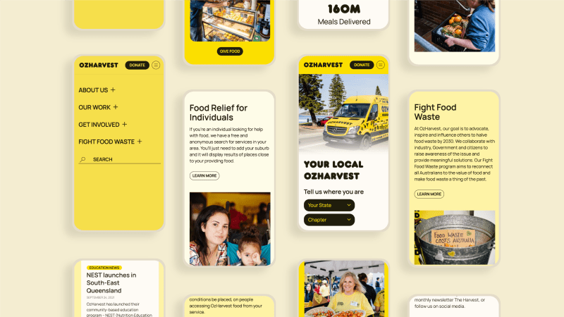
Recategorising and reorganising the website content was no mean feat. Based on our workshop, we were able to shrink the website from 150 to 50 pages by implementing a simpler information architecture that considered the needs of every audience proportionally. We built a minimalist menu containing only the essentials, alongside a powerful filter search to help visitors find what they’re looking for quickly. By focusing on module templates rather than page templates or hand-coded layouts, we devised a UI toolkit and block-based editing workflow to build every page and deliver the marketing team’s needs of versatility without relying on design or dev teams in house.

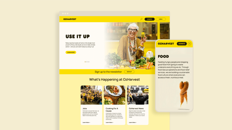
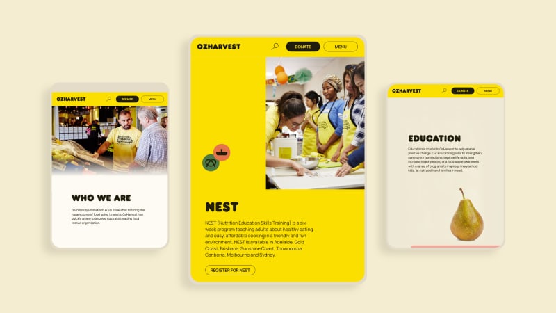
Yellow and black are key to OzHarvest’s highly recognisable brand. However, in the digital space, these two colours felt like they could be more inviting and inspirational. We revised their digital brand to include vibrant feature colours as well as a new sans serif font that increased accessibility. These subtle changes soon turned into a refresh of OzHarvest’s entire brand guidelines.