
A giant rainbow coloured Progress Shark floated above our heads, the audience palpable, waiting for Kylie to come on stage at the WorldPride Opening Concert. This is the most enduring memory I have of the three week event. I stood there, jaw open looking at the drone show spectacle, witnessing it morph gracefully into the Aboriginal Flag, the circle of the sun - a yellow heart. A truly breathtaking symbol of love, inclusivity, hope and Pride (I can only begin to imagine the work that went into getting this idea signed off).
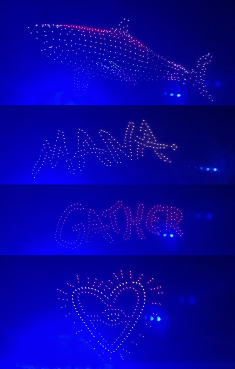
Many more inspiring images, symbols and words graced the sky above our heads before the lights of the drones morphed into its final form… the Amex logo. Boo! Boooooo. And when I say “boo”, I mean the entire crowd at The Domain booed WorldPride’s key sponsor, American Express. It got me thinking, brands must pick their moments to show up at a cultural event like this.
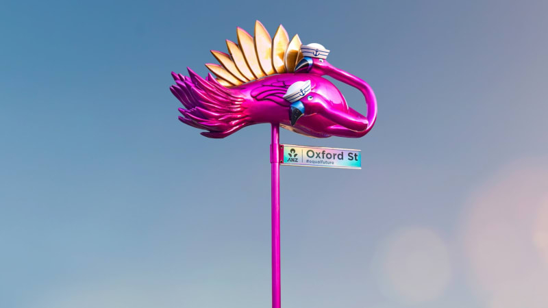
I hope Amex is called out for this gaffe. It won’t have done them any favours despite all the good they’ve been doing. It made me miss ANZ as a key sponsor who has always felt part of the community with campaigns like the GayTMs (fabulously designed ATMs that reflected the diversity of the community), Signs of love (bringing inclusion to rural and remote Australia by pimping up Oxford Streets all around the country) and Hold Tight (a campaign to normalise same sex couples holding hands in public). The key learning here is to show up in a way that feels authentic to the community. And to pick your moments.
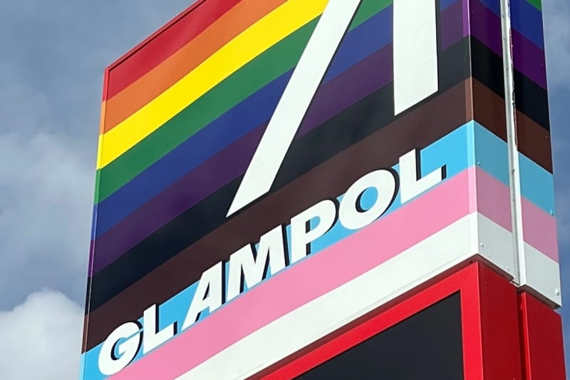
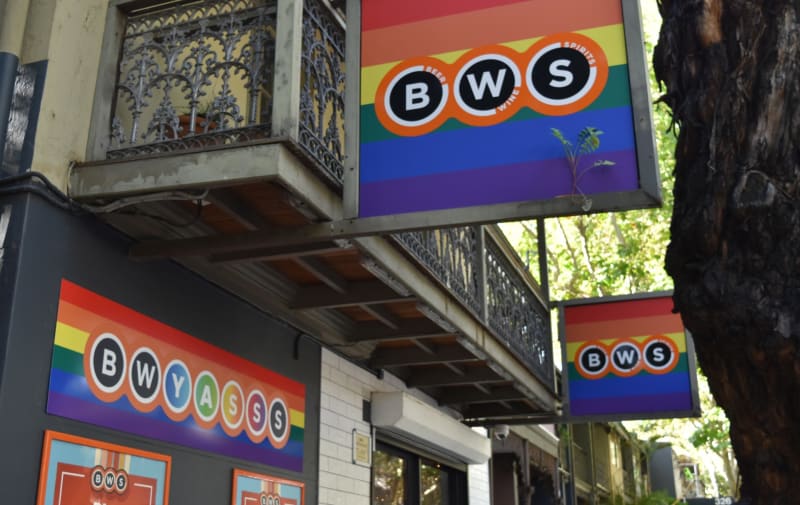
I’d like to discuss the Pride Flag, and its use during Mardi Gras. We’ve all heard of the term ‘rainbow washing’, but there’s two sides of it for me. There’s the side where councils actively encourage shops and businesses to don their rainbow colours for the month of Mardi Gras. This gives the city a fresh coat of awesome and makes queer people feel seen and visitors welcome. Fair. The other side to this is when larger corporations jump on the rainbow bandwagon and do a quick brand refresh to boost sales without any real substance behind it.
Cases in point…
Ampol rebranding to Glampol at two sites in Sydney, conveniently in areas with large queer populations. Ampol are Bronze Employers on the Australian Workplace Equality Index which begs the question: why show up in only two locations?
BWS has the same strategy by rebranding briefly to BWYASS at their Oxford Street, Darlinghurst and Paddington stores. Why only in those locations?
And then there’s the issue of brands changing their social media icons to include rainbow colours, but only in markets where they feel safe to do so. Putting a rainbow wash over your brand does not an ally make. Having an inclusive workplace does.
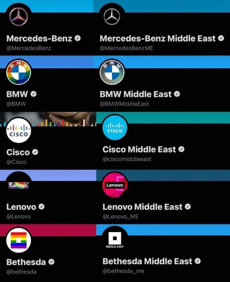
The rainbow flag is a powerful symbol of diversity and inclusion for the LGBTQIA+ community, its appropriation by brands is diluting that power.
My advice for brands who are thinking of wearing the rainbow flag at next year’s Mardi Gras?. Wear it because you’ve sweat all year to make your business inclusive to queer people. Wear it because you champion diversity at every level. Wear it because you welcome queer people to your business with open arms. Wear it all across Australia so queer people feel seen nationwide. Wear it all year long. Wear it because you mean it. Wear it because you deserve it. And wear it with pride.
Paper Moose is an equal-opportunity employer, a B-Corp, and proudly supports our LGBTQIA+ team, suppliers and clients.

We acknowledge the Traditional Custodians of the land upon which we create, the Gadigal People of the Eora Nation. We pay our respect to their Elders past and present, and extend that respect to all Aboriginal and Torres Strait Islander peoples today.
Always was, always will be, Aboriginal land.